Matplotlib figure gallery
Six ways to show scientific evidence
Back to the course · Week 9 slides · Download the notebook and complete code
These Chemical Engineering examples use synthetic data. Choose a plot that answers your question, then make the observations, units and uncertainty easy to read. The gallery uses different data from the main reaction-case lab.
You do not need to write every plot from scratch. Open the supplied notebook, run one example, change a label or axis limit, and see what happens. The full Matplotlib code is included.
1. Time series with an SD band
Compare how a response evolves and show between-run spread without hiding the time course.
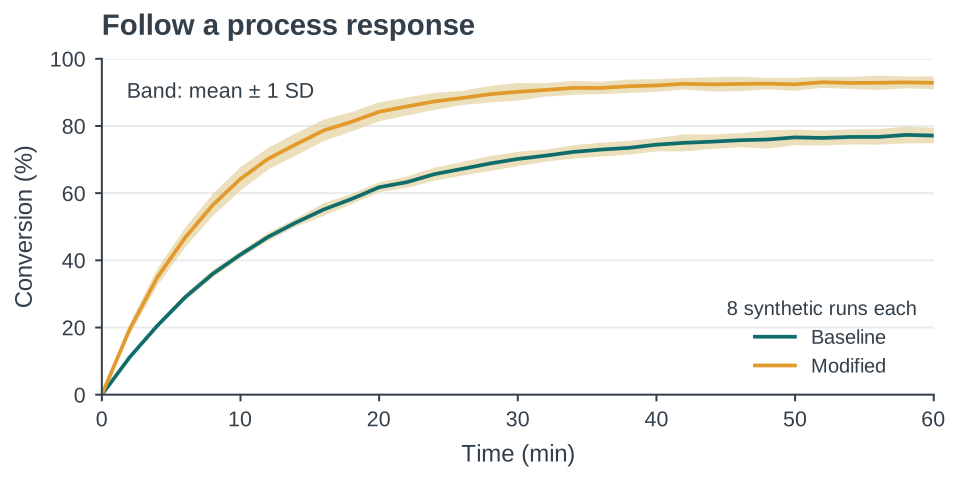
Synthetic step responses. Lines show the mean of eight independent simulated runs per condition; sand bands show ±1 sample SD at each time. They are not confidence intervals.
fig, metadata = gallery.make_time_response(output_dir=output)
plt.show()X(t) = X_inf [1 - exp(-t/tau)]. Baseline X_inf=78%, tau=13 min; modified X_inf=92%, tau=9 min. Each run perturbs X_inf (2.5% SD), tau (6% SD), and adds 0.55-percentage-point observation noise scaled to zero at t=0.
2. Raw observations and a summary
Show replicate counts, spread, possible unusual observations, and the summary on one chart.
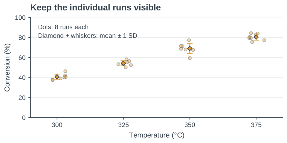
Synthetic conversion at four temperature settings, eight runs per setting. Horizontal dot jitter only prevents overlap; diamonds show means and whiskers show ±1 sample SD.
fig, metadata = gallery.make_raw_points_sd(output_dir=output)
plt.show()Eight normal draws at each setting: mean conversion=[40,55,70,80]% and generating SD=[2,2.5,3,3.5] percentage points at T=[300,325,350,375] °C. Displayed statistics are computed from the draws.
3. Predictions against observations
Inspect prediction errors and whether they vary with an operating condition. A high correlation alone does not establish agreement.
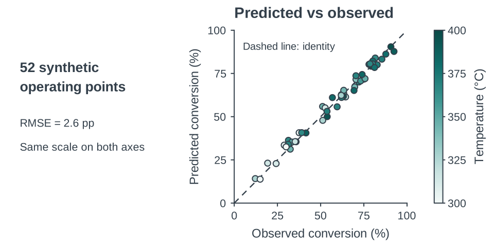
Synthetic observed and predicted conversion for 52 operating points. Equal axis scales and the graphite identity line reveal agreement. Point color encodes temperature on a continuous ramp; this is an illustration, not model validation. RMSE is the root mean squared prediction error, shown in percentage points (pp).
fig, metadata = gallery.make_parity_temperature(output_dir=output)
plt.show()Latent X=100[1-exp(-k(T)*tau)], k(T)=0.20 exp(0.015(T-350)) min^-1. Observed X adds N(0,2.2) percentage points. Predicted X=0.97X+1.5+N(0,1.4), clipped to physical bounds. T~U(300,400) °C and tau~U(1,8) min.
4. A heatmap of operating conditions
Compare a measured or calculated grid and locate broad patterns across two factors without hiding exact values.
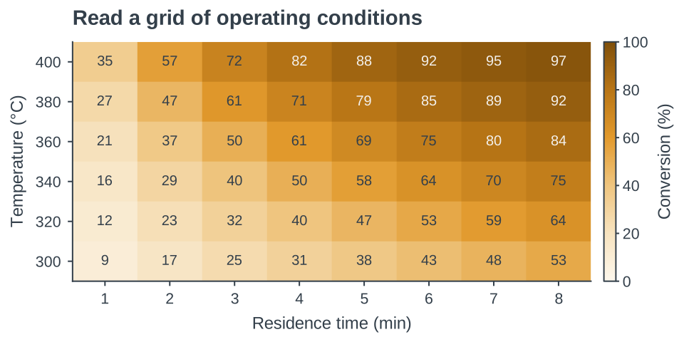
Synthetic conversion at 48 operating settings. Cell labels round the model output to whole percentages; the color scale is fixed at 0–100%. The six temperature rows and eight residence-time columns are discrete settings.
fig, metadata = gallery.make_operating_heatmap(output_dir=output)
plt.show()X(T,tau)=100[1-exp(-0.20 exp(0.015(T-350))*tau)]. Temperature: 300,320,…,400 °C; residence time: 1,2,…,8 min. Illustrative model with no experimental noise.
5. Contours of equal response
Explore tradeoffs between two continuous operating variables and follow equal-response combinations within a justified model domain.
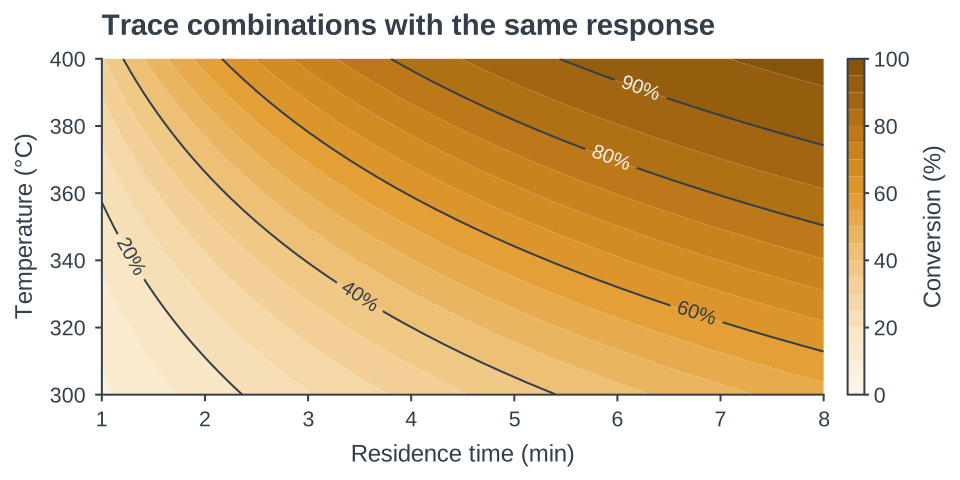
The same synthetic model and 0–100% color scale as the heatmap, evaluated on a fine grid. Labeled contours connect equal conversion. Smooth regions reflect the assumed model, not additional measurements.
fig, metadata = gallery.make_response_contours(output_dir=output)
plt.show()Identical equation to 04_operating_heatmap, evaluated at 101 temperatures from 300 to 400 °C and 113 residence times from 1 to 8 min. No extrapolation beyond that displayed domain.
6. Distributions beyond the mean
Compare centers, spread, and distribution shape while keeping sample sizes and observations visible. A violin is descriptive, not a test of significance.
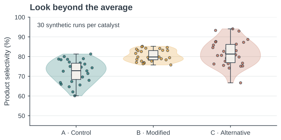
Thirty synthetic selectivity values per catalyst. Dots are individual runs; violin width is a smoothed density. Boxes span the interquartile range with a median line; whiskers extend to the most extreme points within 1.5 IQR. The y-axis starts at 45%, as labeled.
fig, metadata = gallery.make_catalyst_distributions(output_dir=output)
plt.show()Thirty draws from normal distributions with mean=[72,81,83]% and SD=[5,3,7] percentage points for A/B/C, clipped to 0–100%. Gaussian KDE bandwidth factor 0.55; horizontal jitter has no scientific meaning.
Your first change
Run the setup cell in the supplied notebook, then try this:
fig, metadata = gallery.make_time_response(output_dir=output)
ax = fig.axes[0]
ax.set_title("My process-response figure", loc="left")
ax.set_xlim(0, 40)
fig.savefig(output / "my_response.pdf", bbox_inches="tight")
plt.show()
The axis change does not change the data. Check how it changes what the reader notices.