Figure Laboratory with Matplotlib
Week 9 · 2105620 · Python for first-time users · 09:00–12:00
15 October 2026
Today’s deliverables
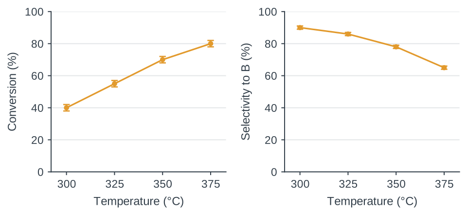
A two-panel figure with units and defined SD bars
A 40–70-word caption that matches the plotted data
A notebook that recreates the figure after a restart
Today’s routine: predict a change, run the cell, check the result.
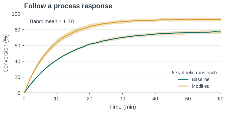
Time series with an SD band
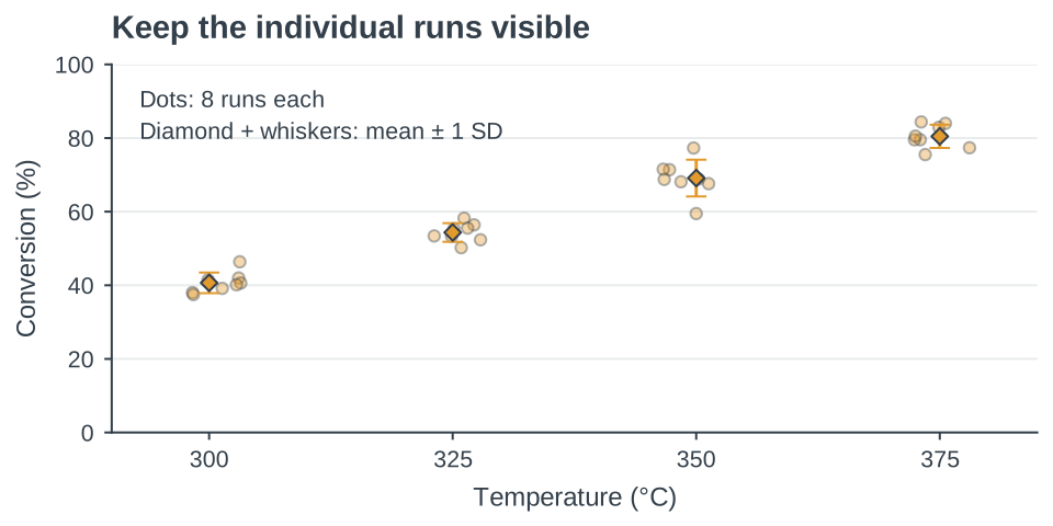
Raw observations and a summary
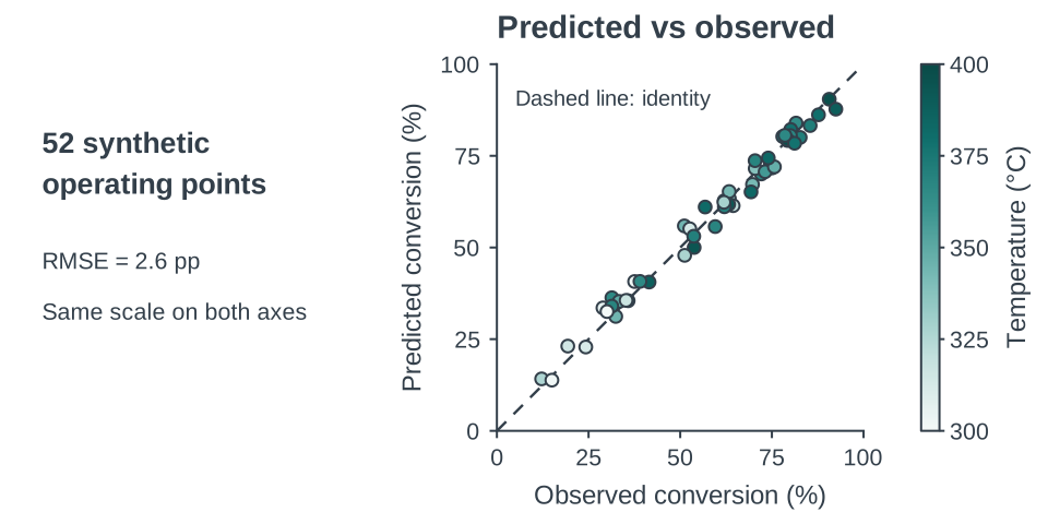
Predictions against observations
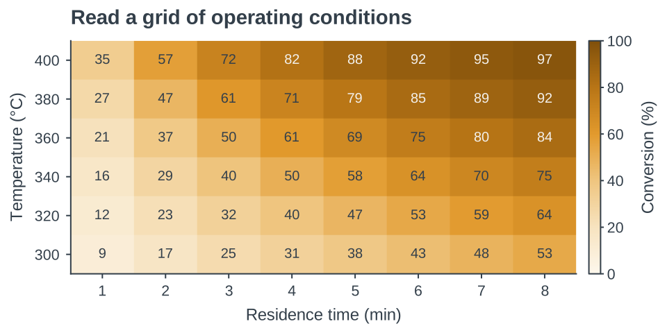
A heatmap of operating conditions
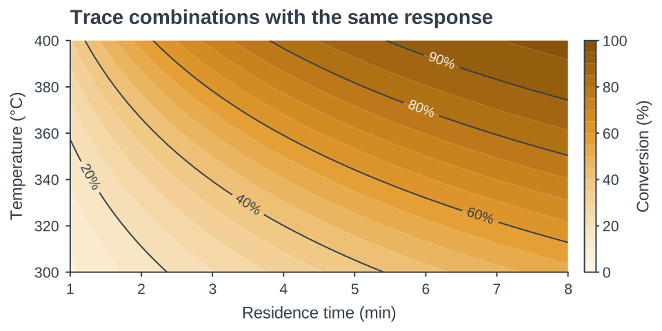
Contours of equal response
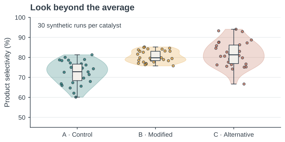
Distributions beyond the mean
Notebook basics
A code cell runs Python. A Markdown cell explains it.
Shift + Enter runs a cell. The Run button also works.The kernel keeps values in memory until you restart it.
Run code cells from top to bottom. Wait for each to finish.
Code cell 1: setup. Code cell 2: variables and lists.
First run
Unzip the lab materials into one folder.
Open week09_starter.ipynb in the prepared Jupyter environment.
Keep the CSV and skh_palette.py beside the notebook.
Run code cell 1 . Look for Setup complete .
If setup is still blocked at 09:15: work with a partner and use the instructor’s running notebook.
A variable stores a value
= 300 = 40 print (temperature_C, conversion_pct)Expected output: 300 40
Change temperature_C to 325. Predict, run, then check.
The names record our intended units. Python stores the numbers.
Lists preserve the pairing of values
= [300 , 325 , 350 , 375 ]= [40 , 55 , 70 , 80 ]print (len (temperature), len (conversion))Expected output: 4 4
Pair by position: 300 °C with 40%, then 325 °C with 55%.
Code cell 2: each x value needs a matching y value.
Functions and named arguments
= plt.subplots()= "o" , linewidth= 1.8 ,= skh.C["amber" ])fig: the whole figure. ax: one plotting area.
plot(...) draws data. Named arguments set its appearance.
After code cells 1–2: try marker="s". Check what changes.
Errors are clues
NameErrorCorrect spelling? Definition cell already run?
FileNotFoundErrorCSV beside notebook? Exact filename?
KeyErrorColumn name matches df.columns?
SyntaxErrorQuotes, commas and brackets complete?
Read the last error line , then the line it points to.
Reading a CSV file
= pd.read_csv("synthetic_reaction_runs.csv" )print (df.columns.tolist())print (df.groupby("temperature_C" ).size())Code cell 3: setup already imports pandas as pd.
Check: 12 rows, 4 temperatures, 3 independent runs each.
The structure of the teaching data
300
1
38
91
300
2
40
90
300
3
42
89
One row = one independent simulated run at fixed residence time, 2.0 s.
First 3 of 12 rows. Conversion and selectivity in the same row belong to the same run.
The first scatter plot
= plt.subplots()"temperature_C" ],"conversion_pct" ],= skh.C["amber" ], s= 36 )Code cell 4: brackets select a column. Each point is one run.
Try s=64. Marker area changes. The data stay fixed.
Labels state the quantity and unit
"Temperature (°C)" )"Conversion (%)" )0 , 100 )300 , 325 , 350 , 375 ])In code cell 4 , keep these lines before plt.show().
Run the whole cell again. Check quantity, unit and tick positions.
Checkpoint before the break
The figure contains 12 runs at four temperatures.
The axes show Temperature (°C) and Conversion (%) .
Both list variables still contain four entries.
Explain one changed line and its visible effect to a partner.
If the plot fails, read the first failing cell with your partner.
Break
15 minutes
Resume at 10:30
The summary should match the original data
= df.groupby("temperature_C" ).agg(= ("conversion_pct" , "mean" ),= ("conversion_pct" , "std" ),= ("selectivity_pct" , "mean" ),= ("selectivity_pct" , "std" )Code cell 5, at 300 °C: X = 40 ± 2%, S = 90 ± 1% (mean ± SD).
Three runs per temperature. Sample SD uses n − 1.
Error bars show a defined quantity
= plt.subplots()"mean_X" ],= summary["sd_X" ], fmt= "o-" ,= skh.C["amber" ], capsize= 4 ,= 1.8 , markersize= 5 )Four means and four SDs in the same temperature order .
yerr gives nonnegative distances from each mean. At 300 °C: 38–42%.
The summary still needs a caption
Points: mean conversion at each temperature
Bars: ±1 sample SD across independent simulated runs
Sample size: n = 3 per temperature
Fixed residence time: 2.0 s
Data status: synthetic, for teaching
A reader should understand the figure without opening the code.
Two panels share one temperature scale
= plt.subplots(1 , 2 , figsize= (9 , 3.8 ),= True , layout= "constrained" # axes[0]: conversion, left panel # axes[1]: selectivity, right panel Code cell 6: one figure, two plotting areas.
Each panel needs its own response label and matching SD column.
Color and symbols carry meaning
Amber marks the response being studied.
Teal represents a control or reference when one exists.
Both response panels use amber and distinct axis labels.
Symbols and labels preserve meaning in grayscale.
A color change needs a reason the reader can understand.
A reproducibility check
Save the notebook, including your caption.
Restart the kernel, then run all cells from the top.
Confirm that both figure files appear again.
Submit the notebook, CSV, palette file, figure and caption.
If a cell fails, fix that first error before checking later cells.
Exit ticket
Show the figure recreated after a kernel restart.
Explain what yerr contains and which runs produced it.
Justify one design choice in a sentence.
Evidence to keep: your notebook, exported figure and caption.
How was today?
Before you leave
Identify one point that is still unclear.
Name one change you will make in your writing or figure.
Complete the short anonymous feedback form.